A Journey to the Colors of Roots with Jotun's 2027 Global Color Collection "Journeys"
Jotun's 2027 Global Color Collection "Journeys" reinterprets living spaces through color stories that extend from memories to discoveries and personal experiences. Consisting of three themes — Memories, Discoveries and Experiences — and 24 colors, the collection highlights the bond that colors establish with personal stories, transforming living spaces into a reflection of individual tastes and experiences.
Beyond defining the atmosphere of living spaces, colors establish a strong bond with memories, experiences and the ways people explore the world. A tone remembered from childhood, an unexpected color encountered during a journey, or personal tastes that change over time can all shape the color choices made in living spaces.
The Jotun Global Color Team describes the starting point of the "Journeys" collection in these words:
"Perhaps a yellow that never fades from your mind, a blue you can never forget, or a deep purple you are still transforming into… Color is a constant companion on our life journey; it often tells far more than we realize.
This year, we invite you to rediscover yourself through your passion for colors. Our new color collection, Journeys, is a personal invitation calling you to explore your own color journey. To return to your roots, refresh your memories, celebrate your discoveries, and discover the colors that shape your experiences… After all, color is the most personal decision we make, and the most universal language we speak.
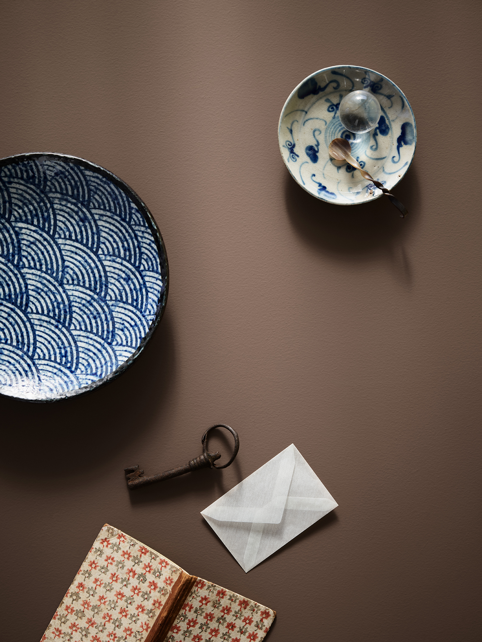
So, which colors do you transform into?"
Three Different Themes Shaping Spaces
Jotun's 2027 Global Color Collection reveals the unique character that colors bring to living spaces through inspiring color schemes and visuals. The Memories, Discoveries and Experiences themes, each comprising eight colors in harmony with one another, offer a total of 24 colors that inspire different decoration approaches.
The colors in the collection create harmonious combinations within their own themes while also being combinable with tones from different themes. This way, everyone can create their own personal color palette based on their own memories, discoveries and experiences.
Memories: The Colors That Accompany Us
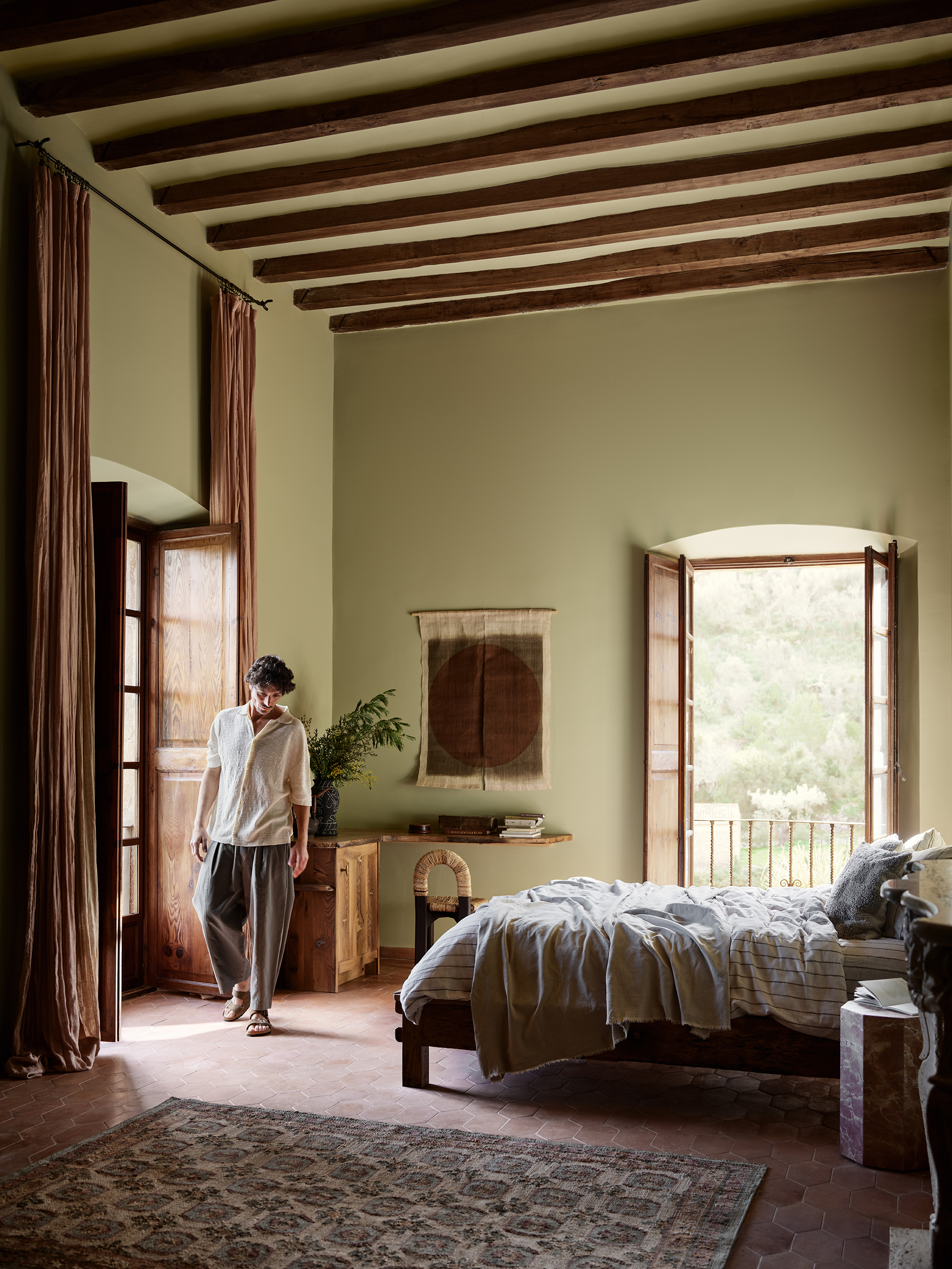
The Memories theme traces colors carried from the past into the present. Soft, soothing tones bring a sense of belonging to living spaces, while warm terracotta and earth tones combine with yellow and natural green to highlight a feeling of trust and warmth.
Inspired by Jotun's century-old color heritage, the theme brings tones rediscovered from the color archive together with new colors. The palette, which harmonizes with objects from the past, natural materials, and pieces carrying personal meaning, forms a bond between the past and the present through colors.
Jotun 0290 Biri stands out in the collection as a 1960s green with golden reflections, brought back to light from the brand's color archive. Warm earth tones such as Jotun 2993 Kilim combine with rich matte textures to add depth and warmth to spaces. The new golden-toned white Jotun 11364 Century White complements warm terracotta and earth tones.
Jotun 20118 Amber Red, with its vivid and elegant character, reveals the depth of the color especially on matte surfaces. Jotun 1627 Retro, in yellow-green tones, adds freshness to living spaces, while creating a nostalgic and intimate atmosphere when paired with reddish tones such as Amber Red and Kilim.
Jotun 8753 Yellow Memories, a saturated and soft yellow-green tone, harmonizes with warm neutrals such as Jotun 11363 Nostalgic Whisper. Its appearance changing with daylight brings a lively and positive feeling to living spaces.
Discoveries: The Colors That Expand Our World
The Discoveries theme draws inspiration from the people, places and different cultures encountered during journeys. Vivid blues, deep purples, modern pinks and warm yellows come together with unexpected color pairings, allowing for the creation of free and personal living spaces.
In this theme, each color pairing tells a different story, while living spaces become an expression of the person's connection with the world.
Jotun 3343 Dusty Purple, with its matte finish and soft reddish-purple tone, strengthens the sense of depth in spaces. When paired with a bold blue such as Jotun 4223 Sama, which can be preferred for ceilings, it creates a daring contrast.
Jotun 20256 Balmy Pink, with its pink-rose tone carrying golden reflections, offers an elegant, playful and modern character. This tone, which harmonizes with neutral colors, adds vibrancy to spaces. Jotun 11365 Morning Glow, a warm and creamy yellow, brings warm light and an intimate atmosphere to the areas where it is applied.
The pairing of Jotun 4223 Sama with Morning Glow creates an energetic and refreshing look in spaces by making use of the contrast between dynamic blue and creamy yellow. Jotun 3570 Velvet Plum, a deep and elegant purple, also offers harmonious combinations with warm neutrals, pink tones and blues.
With its timeless and natural character, Jotun 10966 Almond Beige stands out as a balancing base color within warm beige palettes. It also creates a harmonious ground in multi-colored combinations.
Experiences: Colors That Make You Feel You Belong
The Experiences theme draws inspiration from personal tastes that develop over time and from people getting to know better the environments in which they feel good. Deep color pairings such as midnight blue and golden brown combine with timeless and sophisticated details, giving living spaces a balanced and strong character.
Jotun 1281 Pearl Beige, a light and calm tone, complements pink, red and warm earth colors with its slightly warm and reddish undertones. Jotun 4638 Elegant Blue creates a comfortable atmosphere in living spaces with its balanced and calm stance, while the rich sea blue Jotun 4403 Midnight Blue adds depth to decoration.
Classic contrasts and quality matte textures come together in this theme to create a sophisticated look. Jotun 1799 Spice Brown stands out with its soft depth and characterful stance, while Midnight Blue offers a strong accent in both classic and modern combinations.
Jotun 20162 Mellow brings together elegance and comfort with its character reminiscent of soft burgundy tones, born from the combination of red and brown. Jotun 20185 Friendly Pink, a powdery pink, harmonizes with Mellow, creating an elegant and powerful color pairing that accompanies the pace of daily life.
The 24 Colors in Jotun's 2027 Color Collection
Memories
- Jotun 2087 Roma
- Jotun 20118 Amber Red
- Jotun 2993 Kilim
- Jotun 0290 Biri
- Jotun 11363 Nostalgic Whisper
- Jotun 11364 Century White
- Jotun 1627 Retro
- Jotun 8753 Yellow Memories
Discoveries
- Jotun 20256 Balmy Pink
- Jotun 3343 Dusty Purple
- Jotun 3570 Velvet Plum
- Jotun 4223 Sama
- Jotun 40054 North
- Jotun 10966 Almond Beige
- Jotun 12299 Beige Sheen
- Jotun 11365 Morning Glow
Experiences
- Jotun 12198 Earthy
- Jotun 20162 Mellow
- Jotun 20185 Friendly Pink
- Jotun 4403 Midnight Blue
- Jotun 4638 Elegant Blue
- Jotun 1281 Pearl Beige
- Jotun 1799 Spice Brown
- Jotun 1909 Chalk Ochre
Jotun's 2027 Global Color Collection "Journeys" brings together the traces of the past, the excitement of new discoveries, and personal tastes that evolve through experience with colors. The collection approaches living spaces not only from an aesthetic standpoint, but as places that reflect personal stories and a sense of belonging.
Gallery
Advertisement
Ad Space728 × 90